You’ve been awake since dawn and you step into the airport, a passport clutched in one hand and a coffee cup in the other. The atmosphere is buzzing with fellow bleary-eyed travellers, and the frenetic pace feels dizzying, as if you’re working your way through an obstacle course. Your gate number is called, and each hurdle becomes harder and more challenging – you leap over an abandoned suitcase, swerve a puddle of cola and squeeze through the duty-free minefield. And finally, you spot an arrow-bearing icon guiding you through the maze. A simple silhouette of an aeroplane signals the way to check-in counters, while a suitcase icon beckons towards baggage claim.
You’ve made it to the gate, and you couldn’t have done it without the humble airport pictograms. The visual cues have become a universal language, embedded so deep into society that most may not even notice their impact. They melt into walls, signage and doors as if they were part of the furniture, soaking up as much information as possible to forge their own ecosystem of graphics and illustrations. As travellers, we become unwitting participants in this non-verbal dialogue, each arrow and icon guid-ing us through the labyrinth of terminals, replacing the chaos of the airport – and many other places of civilisation – with an experience that prioritises a straight forward journey above anything else.
Pictograms have long served as a powerful and versatile means of communication. The earliest instances trace back to ancient civilisations, engraved or painted on cave walls. The Egyptians used hieroglyphics, a form of pictogram writing, to convey a wide range of concepts and ideas, while the Sumerians employed pictograms on clay tablets for record keeping. In ancient China, oracle bone script featured pictographic characters inscribed on bones and shells, which were used as a method of pyromantic divination, the practice of using fire or flames to seek knowledge of the future. In the modern era, pictograms have become standardised and widespread, particularly in public spaces and transportation systems. Road signs, for instance, employ a suite of symbols to convey warnings, prohibitions and directions. They do, however, have national variations; Margaret Calvert and Jock Kinneir gave Britain a particularly impressive set as part of their work on a new road signage system. And some signs have turned into graphic fossils – railways are still being represented by long-vanished steam locomotives, and digital speed cameras by traditional-looking analogue cameras. The rise of the emoji is a new form of communication that conveys emotions and expression through a singular icon, albeit one that tends to offer a literal interpretation.
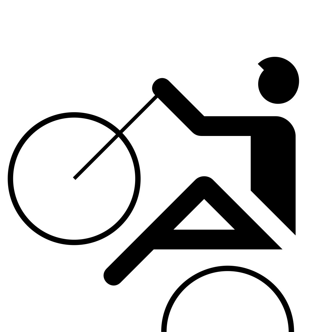
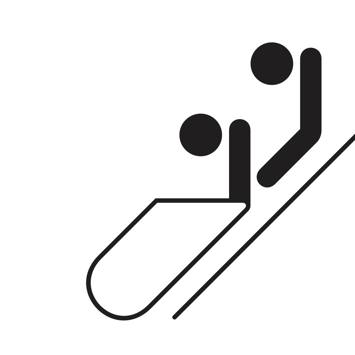
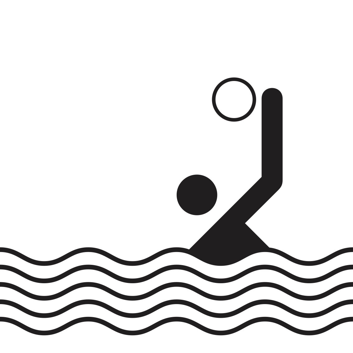
Pictograms have played a significant role in global events, notably the Olympics, which has used them aspart of its branding. Since their inception at the 1964Tokyo Olympics – the first time a graphic visual system was used to communicate the games without words – pictograms have served as a way to convey information, transcend language barriers and allow athletes, officials and spectators from various linguistic backgrounds to easily identify and understand the different sporting disciplines. Kamekura Yusaku developed a modernist emblem and a set of 39 informational icons appearing stencil-like and bold, a cohesive identity wrapping the games tightly together. Yusaku’s pictograms were a turning point. In subsequent games each Olympic host city has tried to put its own creative stamp on the design of pictograms with greater or lesser degrees of success. The most authoritative example is Otl Aicher’s work for the 1972 Olympic Games in Munich.
Aicher attempted to continue the modernist tradition of Bauhaus-era functionalism in post-war Germany. His wife’s sister had been one of the WhiteRose group, whose resistance to Hitler led to their murders. As a memorial to her, and as an institution dedicated to developing a humanistic approach to design that would reinforce a democratic society, they established the Ulm School of Design in 1953. It helped to create the refined language used by Braun consumer electronics. Aicher himself designed a font that he named Rotis, and an identity for Lufthansa.
His most enduring legacy is his work for the Olympics. He created a comprehensive visual identity system that included pictograms, colourful graphics and typography. The identity showcased Aicher’s belief that design could foster communication across cultural and linguistic barriers; it reflected simplicity, clarity and functionality, and rejected the ornamental excesses associated with Nazi propaganda, embracing a more rational and democratic approach to design. As such, the pictograms displayed geometric shapes and a minimalist approach, all the while conveying the dynamic movements inherent in each sport. Whether it was the arc of a diver, stride of a runner or swing of a tennis racket, each pictogram captures the essence of the sport it represented with fluid, energetic lines that remained consistent and accessible throughout.“The copyright-protected system is characterised by a strict grid and consistent simplification,” says Kai Gehrmann, who’s responsible for the global licensing and further development of the Otl Aicher pictograms. “Each symbol follows standardised design rules, com-parable to the grammar rules of verbal language.”
While devising the system, Aicher turned to the iconography of the 1964 Olympics in Tokyo, seeking to devise a suite that was less pictorial and more consistent. He ensured that the essence of each pictogram was captured in a straightforward and comprehensible manner. This system, which became known for its clarity and recognisability, went on to define a whole design epoch; it continued to expand since the 70s and now includes more than 750 pictograms that go far beyond sport. “More than ever before, we read and understand the world around us in images,” says Gehrmann. “Today, pictograms are an integral part of the design of digital interfaces, for example, which should be understandable globally regardless of language. In this respect, the fields of application are even more diverse today than they were during Aicher's lifetime.”
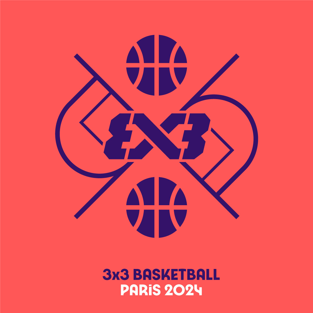
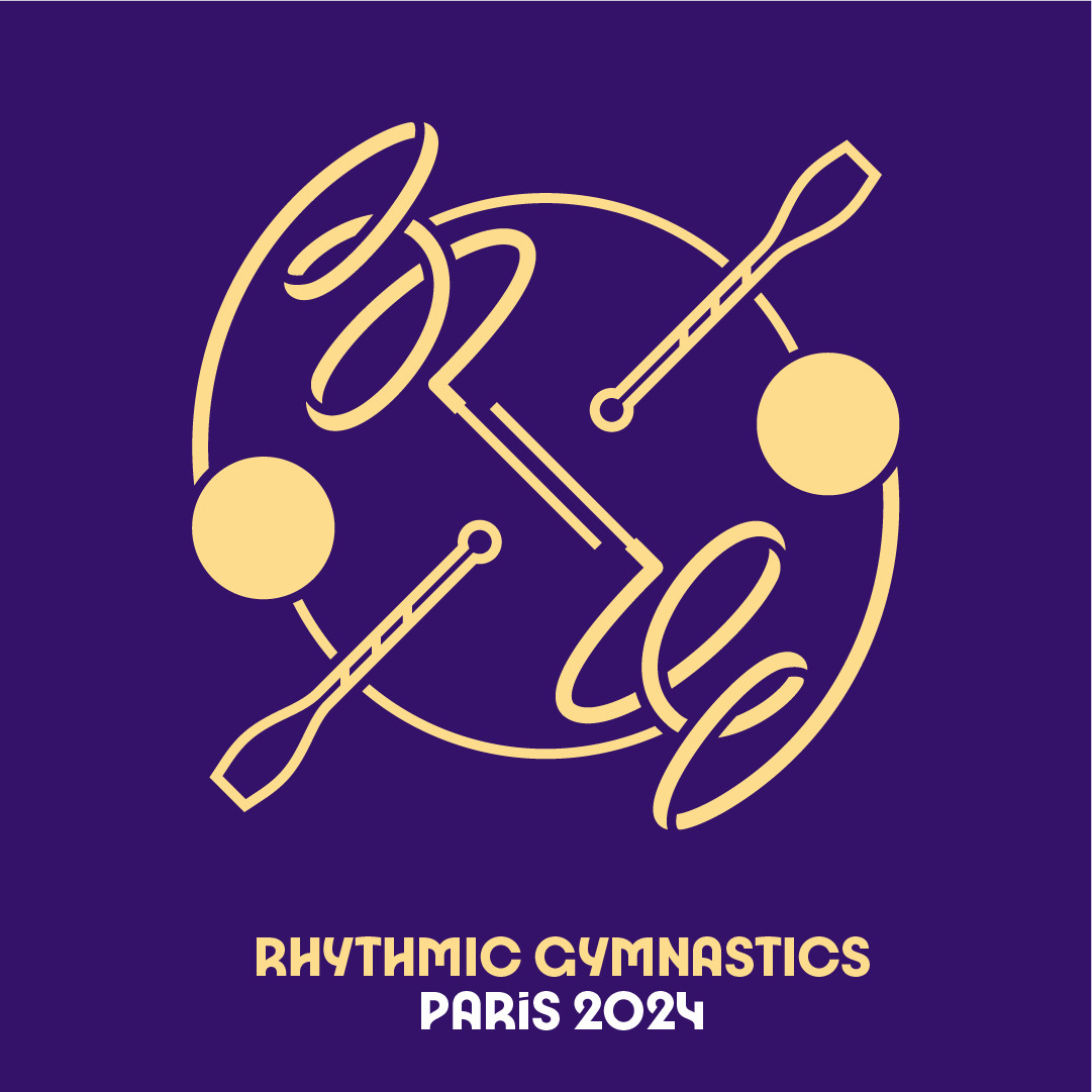
And while many continued to embrace this ethos, others have sought to challenge it. For the Paris 2024 Olympic and Paralympic Games, this new set of icons marks a departure from previous styles, showcasing a wilful break from tradition (or from Aicher). Led by Joachim Roncin, head of design forParis 2024, and in collaboration with agency W, the suite of 62 pictograms are unconventionally dynamic and expressive, capturing the action and excitement of each sport, and the buzzing atmosphere of the Games. Bendy moves of a gymnast and the powerful strokes of a rower are forged into athletic, almost liquid lines and valiant forms, cradled in vibrant colour palettes with a heavy use of purple. Each icon is composed of three graphic elements designed around an axis; eight of which are shared between the Olympic and Paralympic Games.
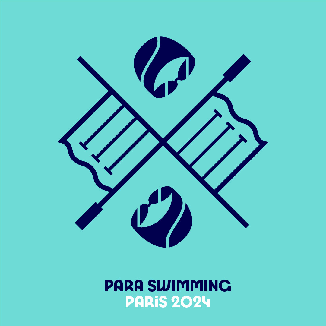
While Aicher’s pictograms were rooted in standardisation and clear communication, the Paris 2024 iconography bears a more idiosyncratic approach that is sometimes hard to interpret. President Tony Estanguet referred to the pictograms as “badges of honour” that symbolise the wearer’s belonging to the chosen sport family, embodying a sense of belonging and community. “A pictogram is also a symbol that is collectable,” said Estanguet at a pictogram launch event. “When you’re an athlete, you're proud about showing off the pictogram of your sport – pins, T shirts… I remember collecting those things.”
The Olympics – and sports in general – wasn’t the first nor only industry to combine pictograms in a systematic approach.
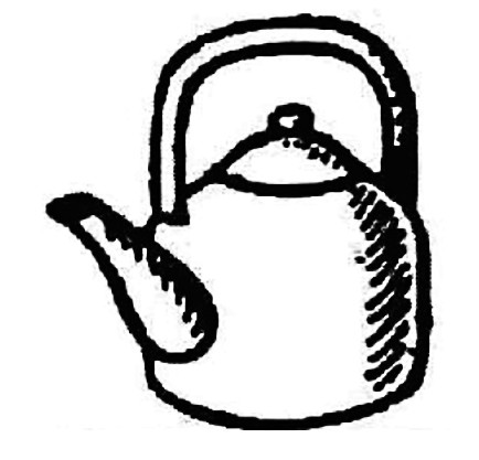
In India, when millions of eligible voters go to the polling booths for the elections, their vote is cast with a symbol: a ceiling fan, bungalow, umbrella, bottle, coconut or a mango to name just a few. Most of the symbols were drawn by hand in pencil by the late draughtsman M S Sethi, who retired in 1992, giving the identity of the icons a sketchy and minimalist aesthetic. The symbols appear on electronic voting machines in India, representing the 2,300-odd political parties; they’re published on banners, plastered across rallies, printed on pamphlets and election manifestos. The icons have been part of the process since 1952, the year India held its first election after the country gained independence from British colonial rule. Because 80 per cent of the population was illiterate, they decided on a foolproof and easy way for voters to be able to identify their chosen parties.

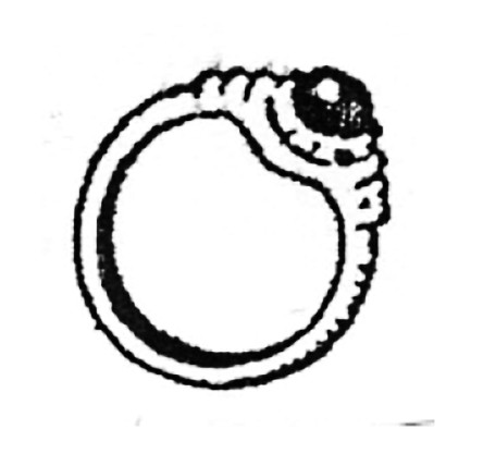
Just like the parties, which ebb and flow with society and popularity, the list of symbols is a work in progress. By 2004, there were fewer than 10 symbols for candidates to choose from – including the ceiling fan, telephone, air conditioner and dish antenna. Now, the Election Commission of India (ECI) maintains thousands, representing everyday life in India. A large portion of these are items of clothing or grooming utensils, many are household items, a couple are transport vehicles and there are just two animals, the elephant and the lion. These are the last remaining on the list due to complaints around ill-treated live animals being used in the rallies. The Maharashtrawadi Gomantak Party (Goa), the Hill State People’s Democratic Party (Meghalaya) and the All India ForwardBloc (West Bengal) have chosen the lion, yet, of course, won’t be able to rally with their real-life mascot. In 1991, the election commission ruled out using fauna as a symbol, too, due to concerns from activists who feared people might attack a creature if item bodied the symbol of an opposition.
Many of the symbols may seem curiously abstract, the nail clippers for example, but they don’t just represent a political party. They elicit the transformation of India from more rural depictions like a plough, cow and cart, to symbols like a tractor, truck and electric pole, then a laptop, computer mouse and USB stick.The symbols are made to be neutral, yet equally bear weight with emotional appeal and their ability to be relatable. And once they’re chosen, or ‘reserved’ by a party, they cannot be used by another again. Despite their rough and pixelated appearance, the Indian election symbols are a powerful and striking example of the part that pictograms can play in national life.
Sign language might be understood as another form of pictogram. Chris Laing, the founder of Deaf Architecture Front (DAF) and Signstrokes, is making significant strides in promoting inclusivity and accessibility by developing signs within the field of architecture. In his research, he found that fewer than 15 deaf people are currently training to become architects in the UK. DAF aims to address the challenges that they face by sourcing interpreters, obtaining learning support and translating specialist terminology into British Sign Language(BSL). Laing also launched Signstrokes to convey architectural concepts.
Laing, an architectural designer who is deaf himself, established both companies in response to the barriers he faced throughout his career. “I had to create and use ad hoc signs with every interpreter that I worked with, as there was no corpus of terms for architecture that was readily accessible,” he says. “Facing challenges like this can be very isolating.” After meeting a fellow student who was facing a similar experience, they both aligned on a standardised set of terms and initiated the launch of Signstrokes. With support from Kate Rowley, a researcher in linguistics at Deafness Cognition and Language ResearchCentre (DCAL), and funding from the architectural practice Haworth Tompkins and the KnowledgeExchange at University of the Arts London, they setup a public workshop to translate the terms into BSL. They followed three strategies – the C hand shape, visibility and two signs becoming one – to develop the terms and turn them into a graphic system aspart of the Signstrokes archive.“Pictograms are used as learning tools in education settings, both for young deaf children aspiring to be-come architects, to students at university and those who want to gain an understanding of the language used in architecture,” Laing says. “It’s a valuable resource for both deaf architects and their hearing colleagues, so as to share knowledge and better communication in a studio setting.”

In some ways, Laing’s visual language can be likened to Aicher’s. It’s visually clear, accessible and universally understood. The graphics have captions and show the content step by step, opening up the language to the deaf community.“Pictograms will play an important role in the future as they represent BSL and other languages in a way that is accessible and inclusive,” he says.
Growing recognition of the importance of inclusive design practices gives Aicher’s philosophy of a language with-out words more relevance than ever. “Aicher was convinced that the clarity and recognisability of pictograms are directly related to the limitation of form and structure to the essentials. Pictograms have a task to fulfil: They enable orientation and understanding. This applies then, now, and in the future,” says Gehrmann.“I do not see inclusion/representation and design/aesthetics as contradictory. The right thing that fulfils the intended task is always also beautiful. It is like mathematics. For a mathematician, a functioning formula will always have an aesthetic quality.”
This feature appeared in Issue 2 of Anima, head here to purchase a copy or subscribe