In among the snowdrifts of cycling jerseys, cliffs of books and magazines, tin toys, cameras and ornamental rabbits, one strand of Paul Smith’s ever-multiplying collection of collections is an assortment of analogue-era artefacts. Despite having been made technologically redundant by the digital explosion, they remain a powerful reminder of what the modern world used to look like.
The analogue signals that would once have brought the original Algol 11-inch portable TV set (designed in 1964 by Marco Zanusso and Richard Sapper) to life, have been switched off now. Although such is its charm that Brionvega now makes a set with modern electronics inside the moulded plastic shell. It belongs to the early days of transistors and cathode ray TV tubes and was designed as a portable object, rather than a piece of furniture, as larger television sets were still seen at the time. Zanusso was a distinguished architect, while Sapper went on to design the famously distinctive Tizio desk light, and the Think Pad, IBM’s first laptop computer.
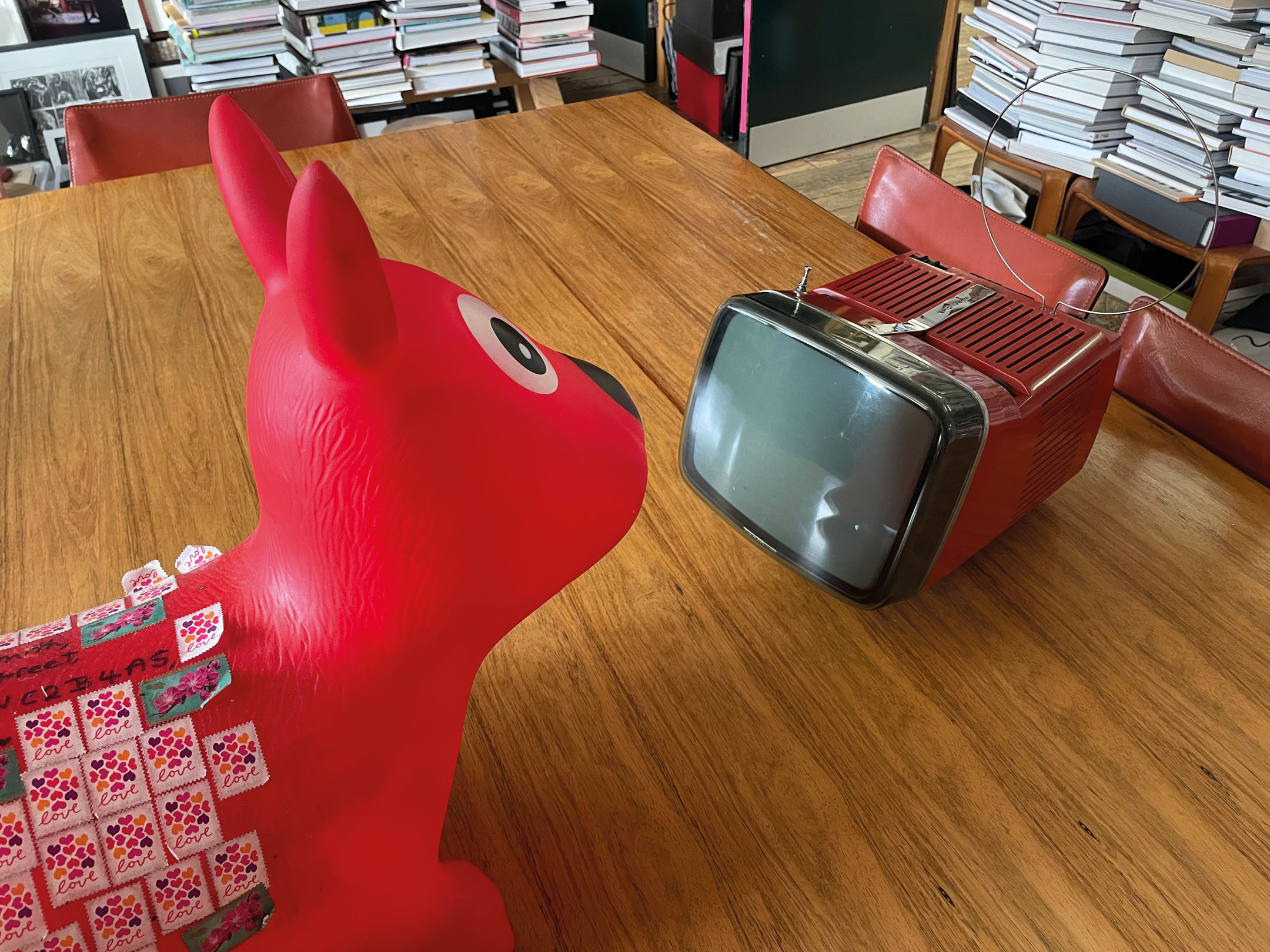
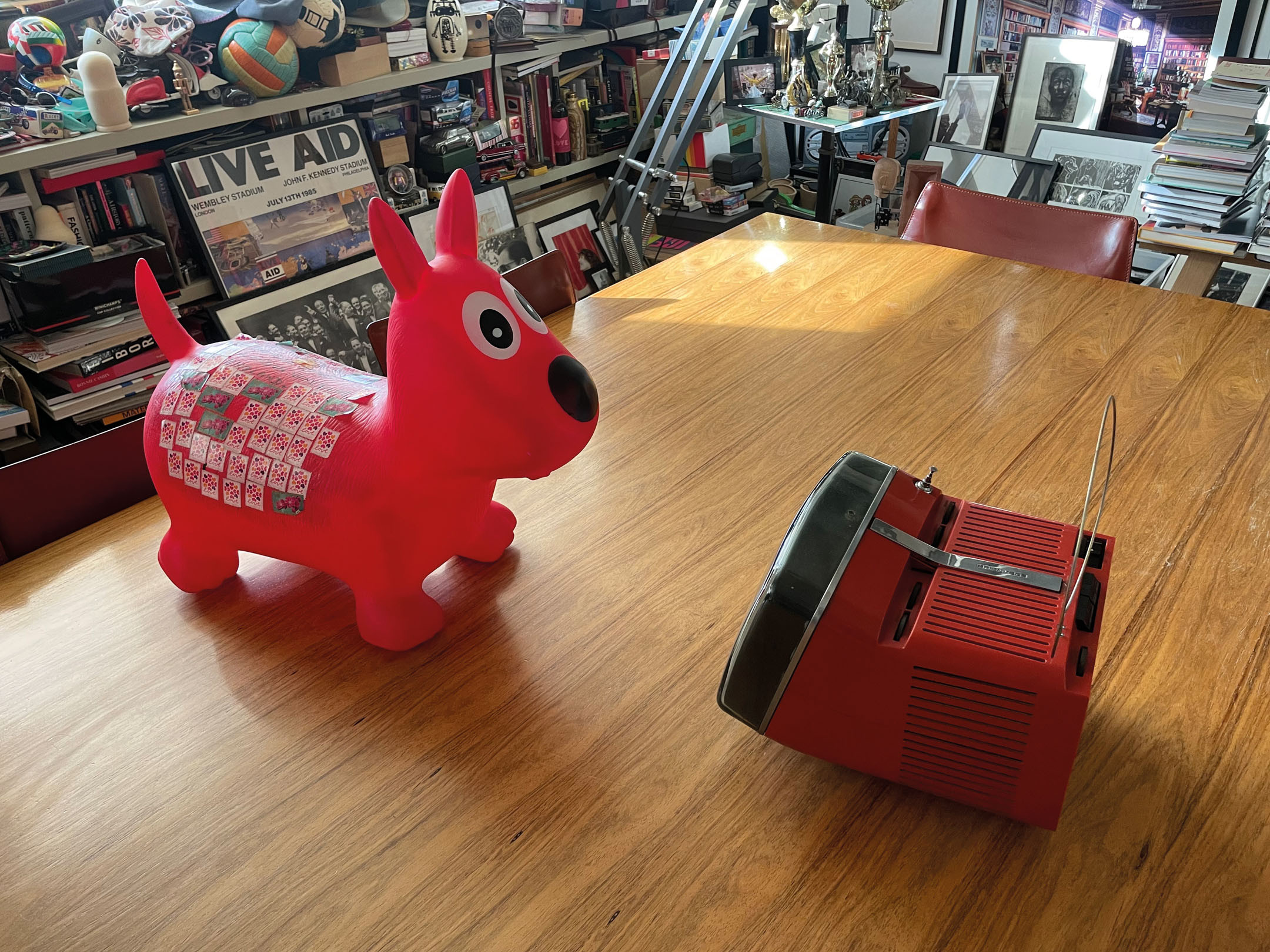
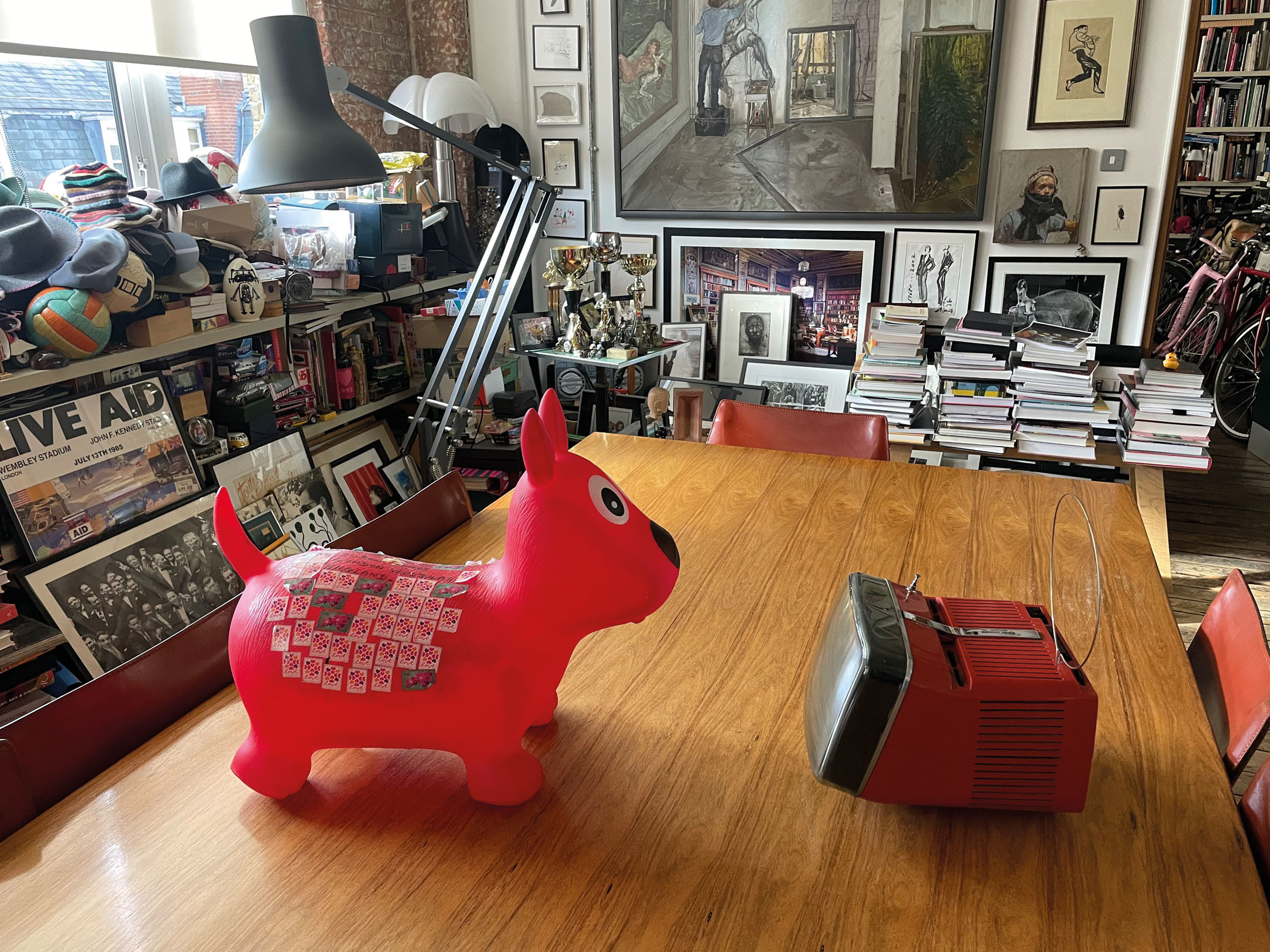
What made the Algol so cute is the way that the up-turned screen not only makes for easier viewing when it’s placed on the floor, but as Zanusso once suggested, it resembles a pet dog, looking expectantly up at its owner.
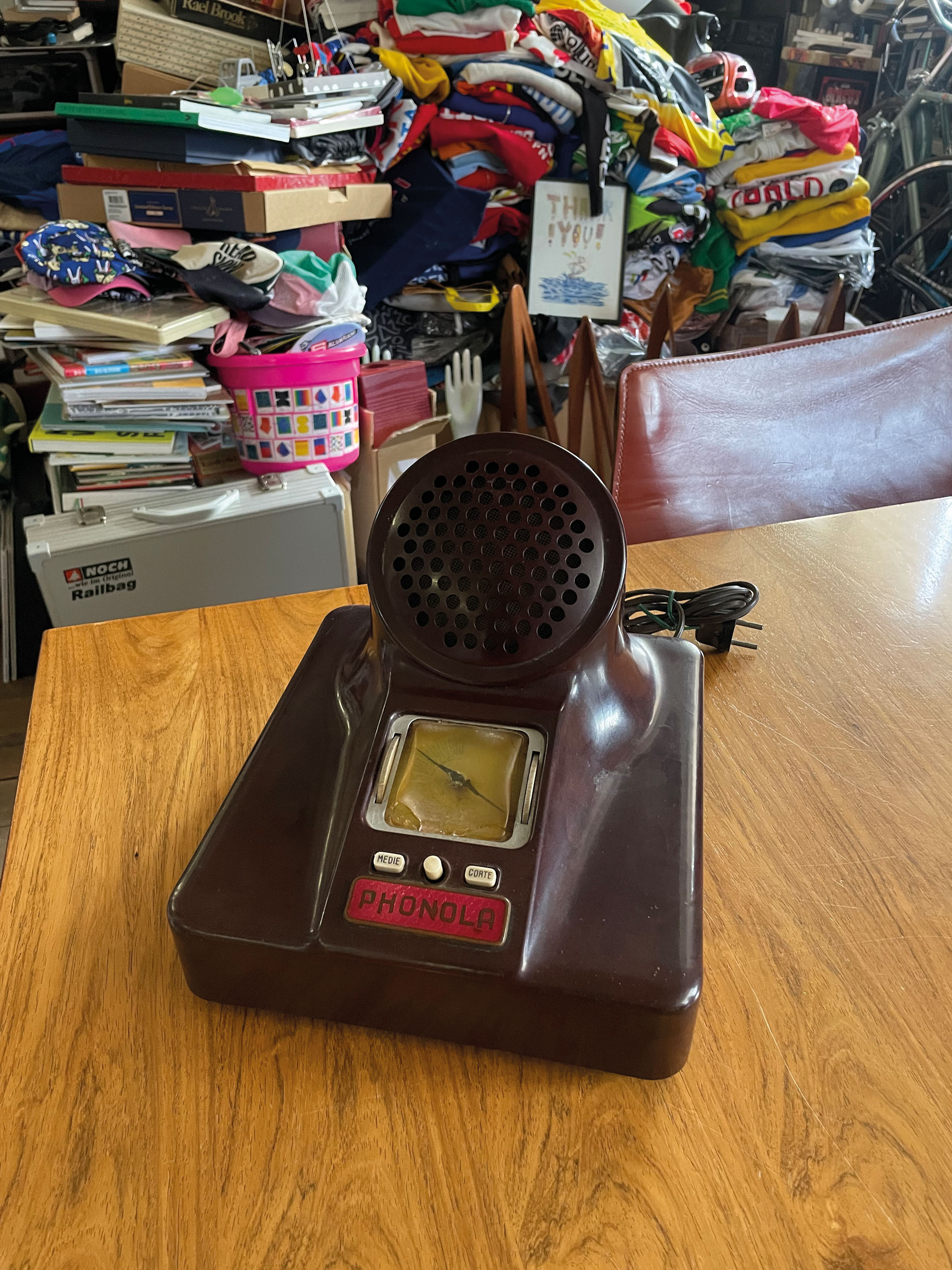
Italy’s designers have a long history of giving machines a personality. That goes back to the oldest radio in Smith’s collection, the Phonola, designed in 1940 using moulded Bakelite by Livio Castiglioni.
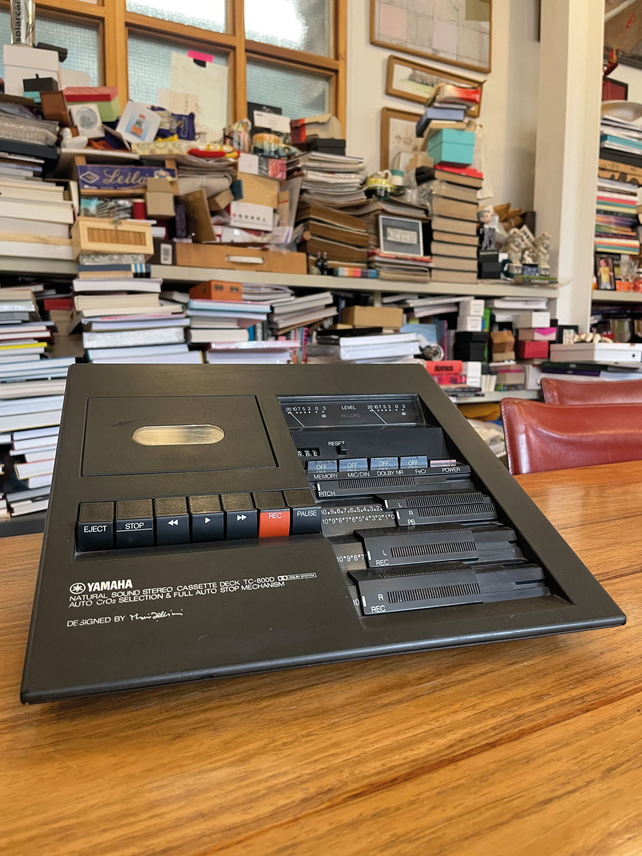
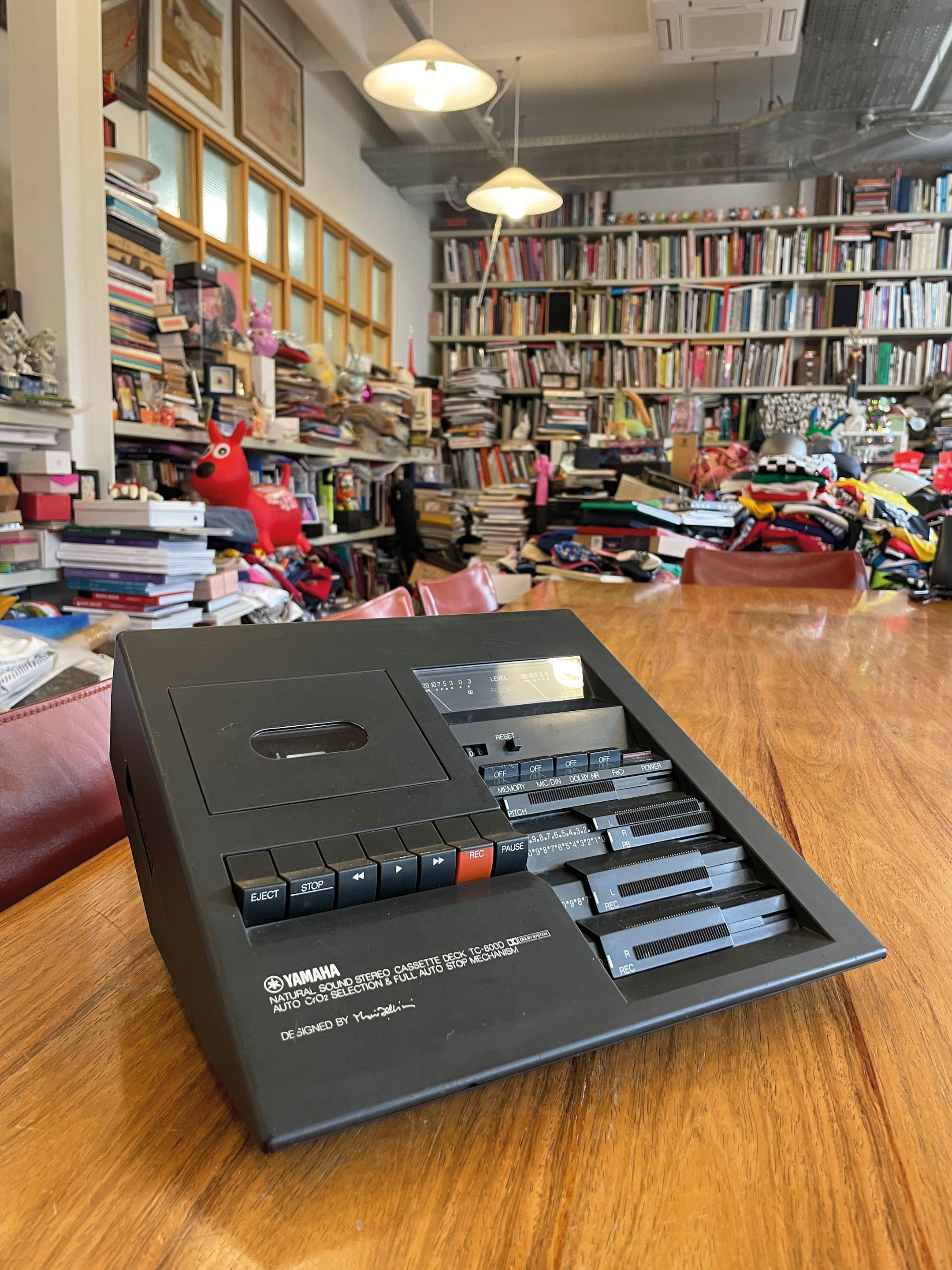
And it was another Italian designer, Mario Bellini, that Yamaha asked to put his signature on the distinctive wedge-shaped cassette deck that for a moment seemed like the last word in music technology.
Part of the reason for Japan’s temporary domination of the world market in consumer electronics was the strategy adopted by Sony to use a strong design language, or rather multiple languages. Matt black was intended to signal precision and reliability for its short-wave radios, yellow was associated with sport. It was also happy to adopt a much gaudier range of colours aimed at attracting attention to its users. Its competitors, especially Pioneer, responded with their own versions.