Alessandro Mendini was always unfailingly congenial, always extremely generous with his time, and welcomed me to Milan as the first editor of Domus from an Anglo-Saxon country in the magazine’s history, even though our approaches to the publication that we both edited, albeit several years apart, could not have been more different. For him, Domus was an extension of his life and work as a designer. For me, the magazine itself was the project. It was my vantage point to explore the world of design.
In person, he was not what I would have expected from my visit to Groningen at the time of the city’s new museum building opening in 1994. His design could fairly be described as extreme, while he himself was the embodiment of well-mannered restraint. But then Mendini always wore his green Loden coat, the uniform that the Milanese bourgeoise use to remind us that their city had once been an Austro-Hungarian provincial capital, even as he set out to undermine and subvert their assumptions.
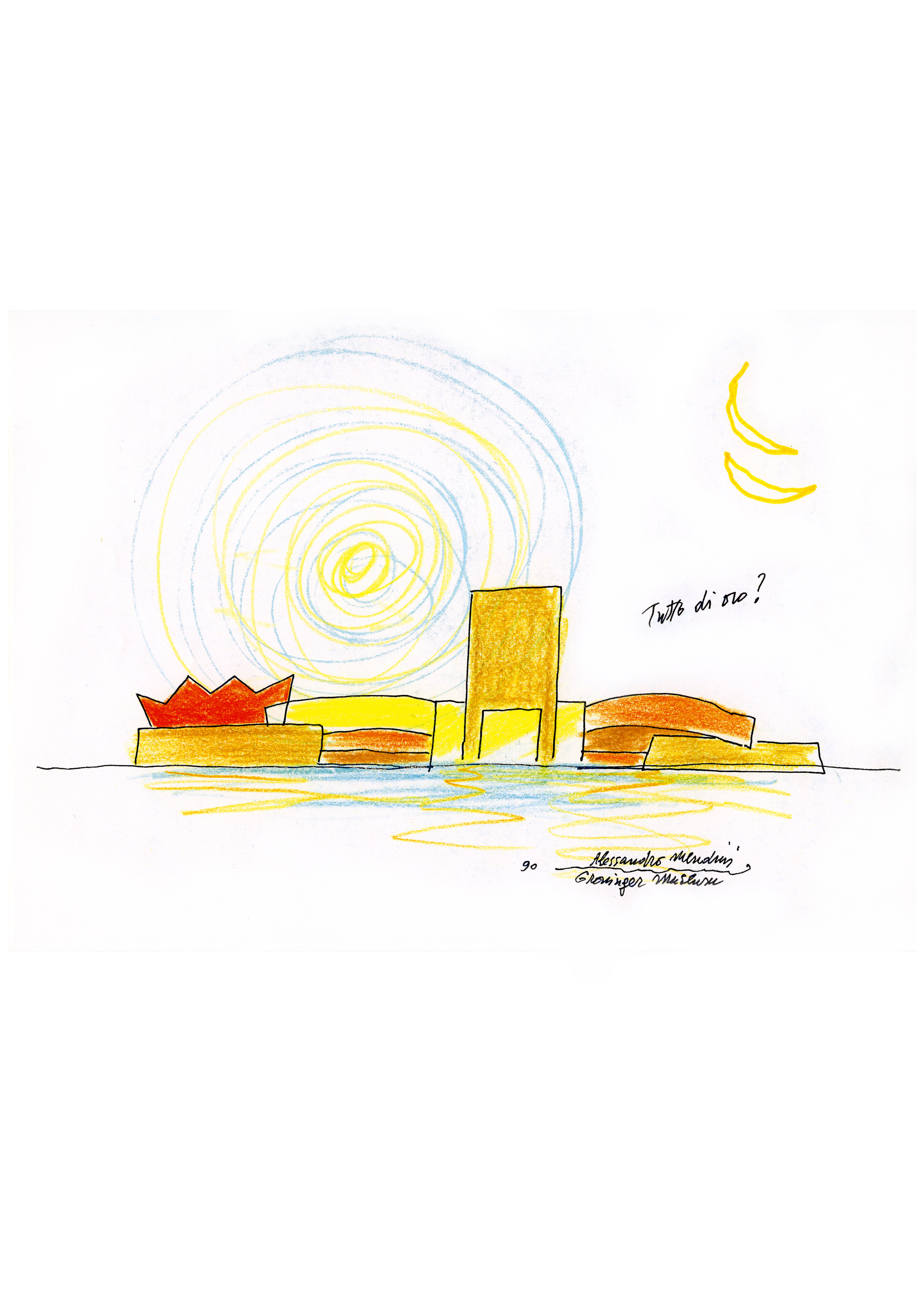
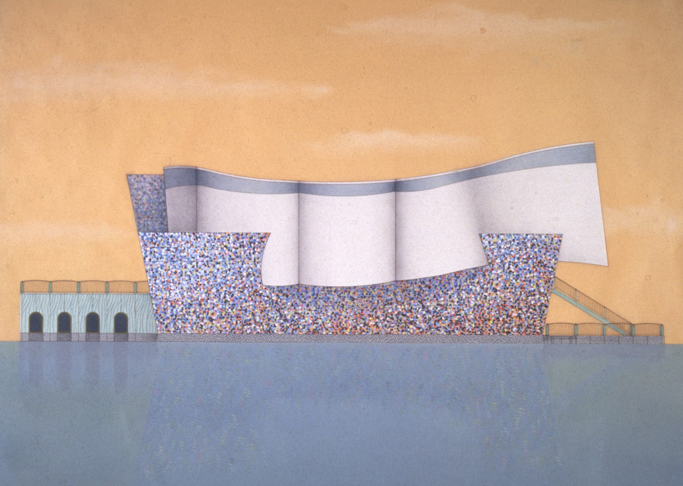
In the context of a remote city in the far north of the Netherlands, the Groninger Museum, which was Mendini’s most ambitious and most complete architectural work, seemed anything but polite. It struck me as an architectural version of exquisite corpse, the surrealist game played by André Breton. The museum was composed of four elements, each clearly designed by a different individual, stitched loosely together in the style of Frankenstein’s monster. One major section, the Coop Himmelb(l)au pavilion, wasn’t even thought of when Mendini, Philippe Starck and Michele de Lucchi started work. Frank Stella was meant to be the fourth participant in the game, but his concept of a Teflon-coated structure proved to be both impractical and too costly. Coop Himmelb(l)au’s replacement had trouble keeping the rainwater out.
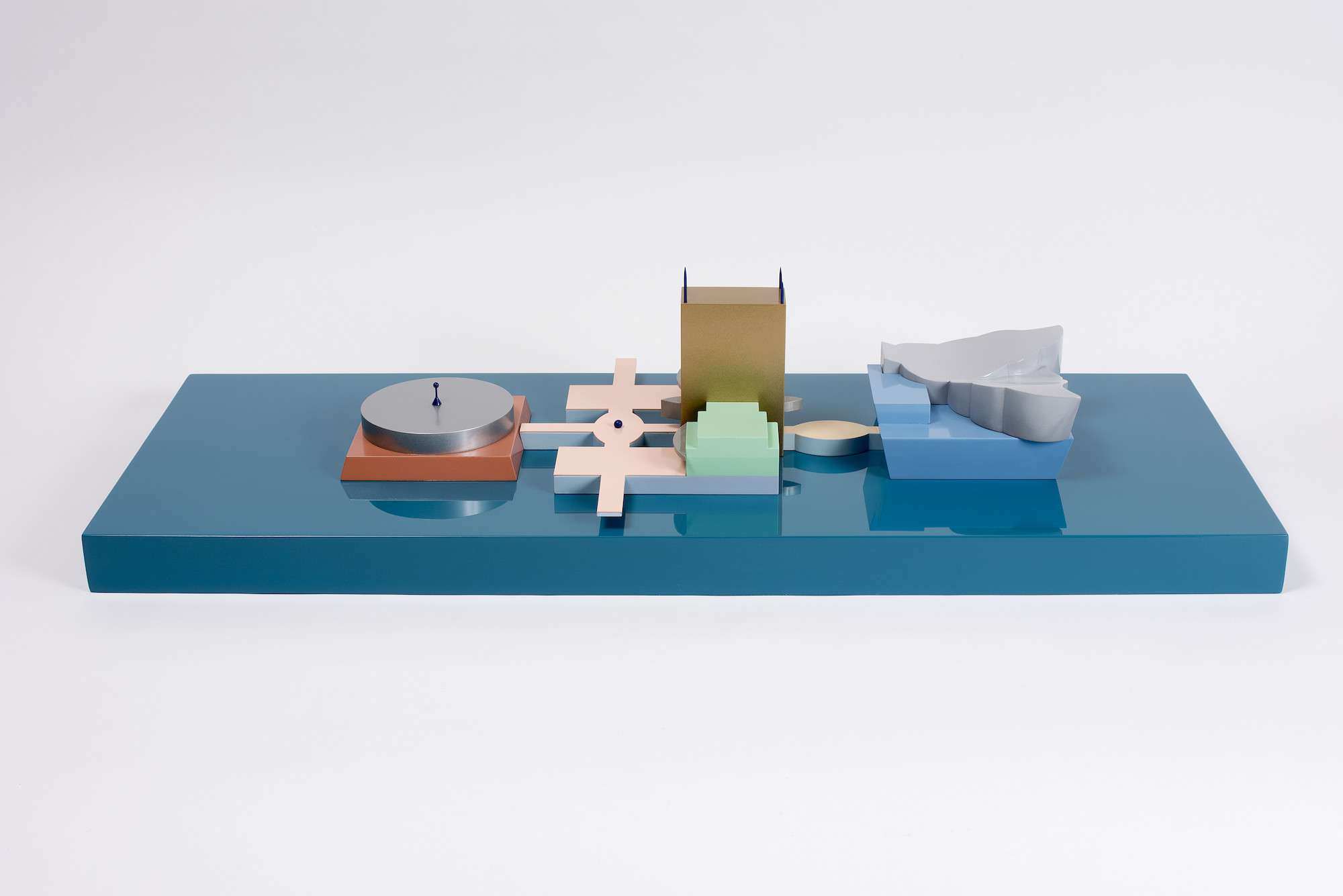
None of the individual architectural pieces relates to the others in shape, form or colour, and yet the resulting train crash has a powerful presence. At first the local community was horrified. A series of sustained protests blocked construction work on the site for a whole year. In the way of such disputes, the bad feelings dissipated once the project opened, and it has come to be embraced as an idiosyncratic but essential landmark for the Netherlands.
The idea of assembling a structure made up from multiple ill-fitting components came not from Mend-ini himself, but from the museum director, FransHaks. He commissioned Mendini to be the principal architect directly, on the understanding that he would bring together multiple voices to work on distinct parts of the project. The work of the four design teams amounted to the largest elements in the museum’s collection, dwarfing the scale of its paintings, ceramics and furniture, but acting just as much as visitor attractions. It was an approach that certainly reflects Mendini’s essential strengths. He was as much a curator and an editor as he was an architect or a designer. At the time Haks first approached Mendini in his architectural studio, established with his brother in 1989, he was still comparatively inexperienced. He had made his reputation not by building, but for the quality of his skills as an editor and a curator, and the attention that his project to find new designers for Alessi and transform the brand’s identity had attracted. Mendini’s relationship with Haks was important for both men. As well as the museum, Mendini designed Haks’ home in Amsterdam.
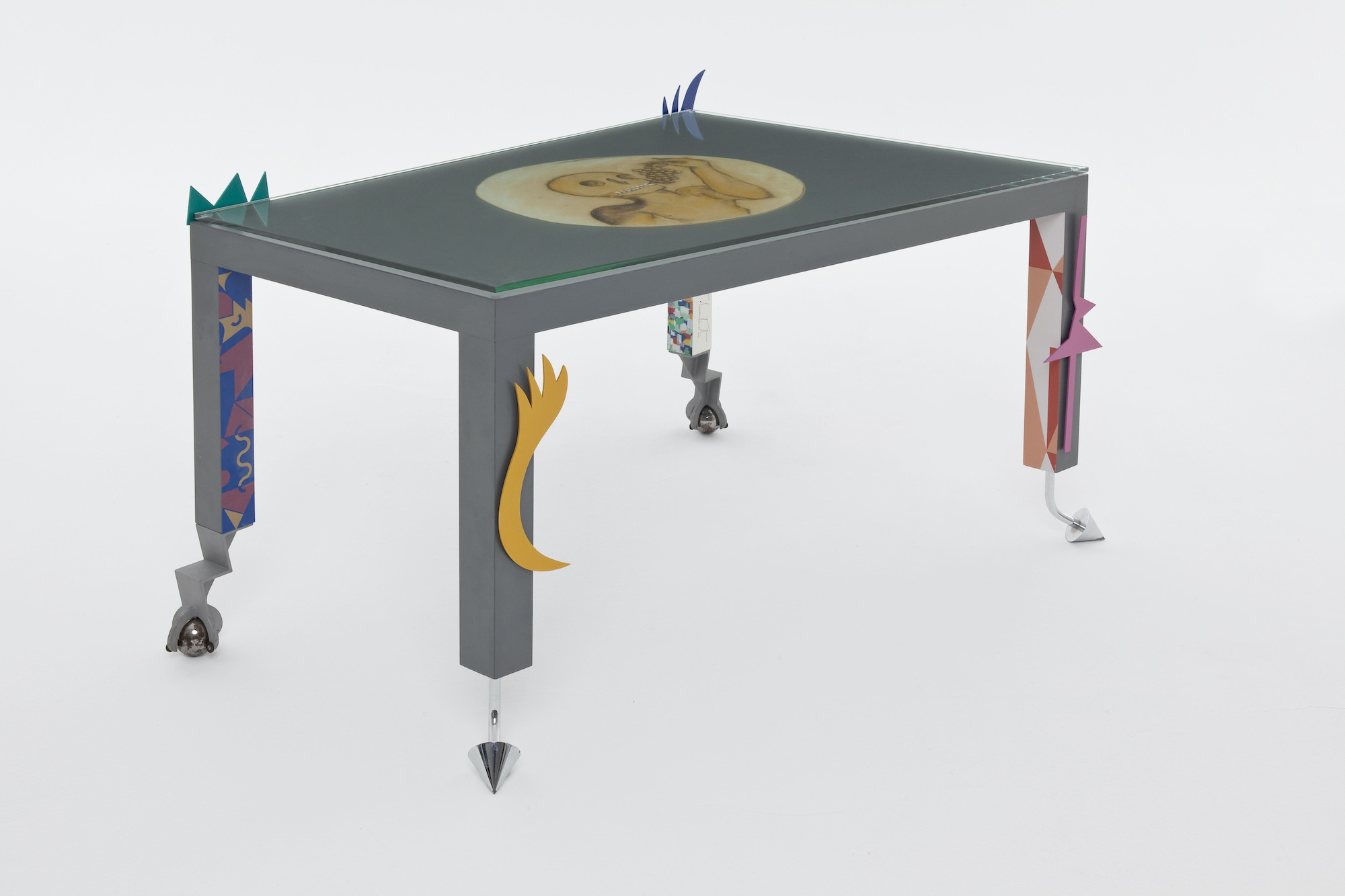
Mendini, born in 1931, grew up in a house in Milan designed for his parents by Piero Portaluppi, a distinguished architect and collaborator of Gio Ponti. After graduating as an architect himself, Mendini worked in Marcello Nizzoli’s studio, which was responsible for many of Olivetti’s most memorable products. But Mendini first attracted attention for his work as a magazine editor.
Even before he identified the Arte Povera movement, Germano Celant, the art critic and advisor to Miuccia Prada’s Fondazione Prada, had coined the term ‘radical design’ to describe the work of Andrea Branzi, Enzo Mari, Ettore Sottsass and the others who came together briefly in the 1970s. Mendini became the editor of Casabella just as they were coming to prominence. He identified the magazine with a judicious range of views filling its pages between 1970 and 1975. Their most consequential expression was the Global Tools movement, heavily influenced by Californian and British radical thinking as expressed by Stuart Brand’sWhole Earth Catalogue, which is best described as a print version of Wikipedia. As Brand put it on the annually updated cover of the book, it offered access to tools. Meetings of the GlobalTools group were held in Ettore Sottsass’s studio invia Manzoni, designers and architects from Naples Florence and Milan came together. They were uncomfortable with the idea that design was simply a technical discipline, put to work for the purposes of sophisticated entrepreneurs. They wanted to find ways to emphasise the cultural significance of design, to use design as a critical tool and undermine the over-simplistic assumptions of the manufacturers who relied on designers to make desirable products for them. The fractious nature of Italian design politics made Global Tools a short-lived movement.
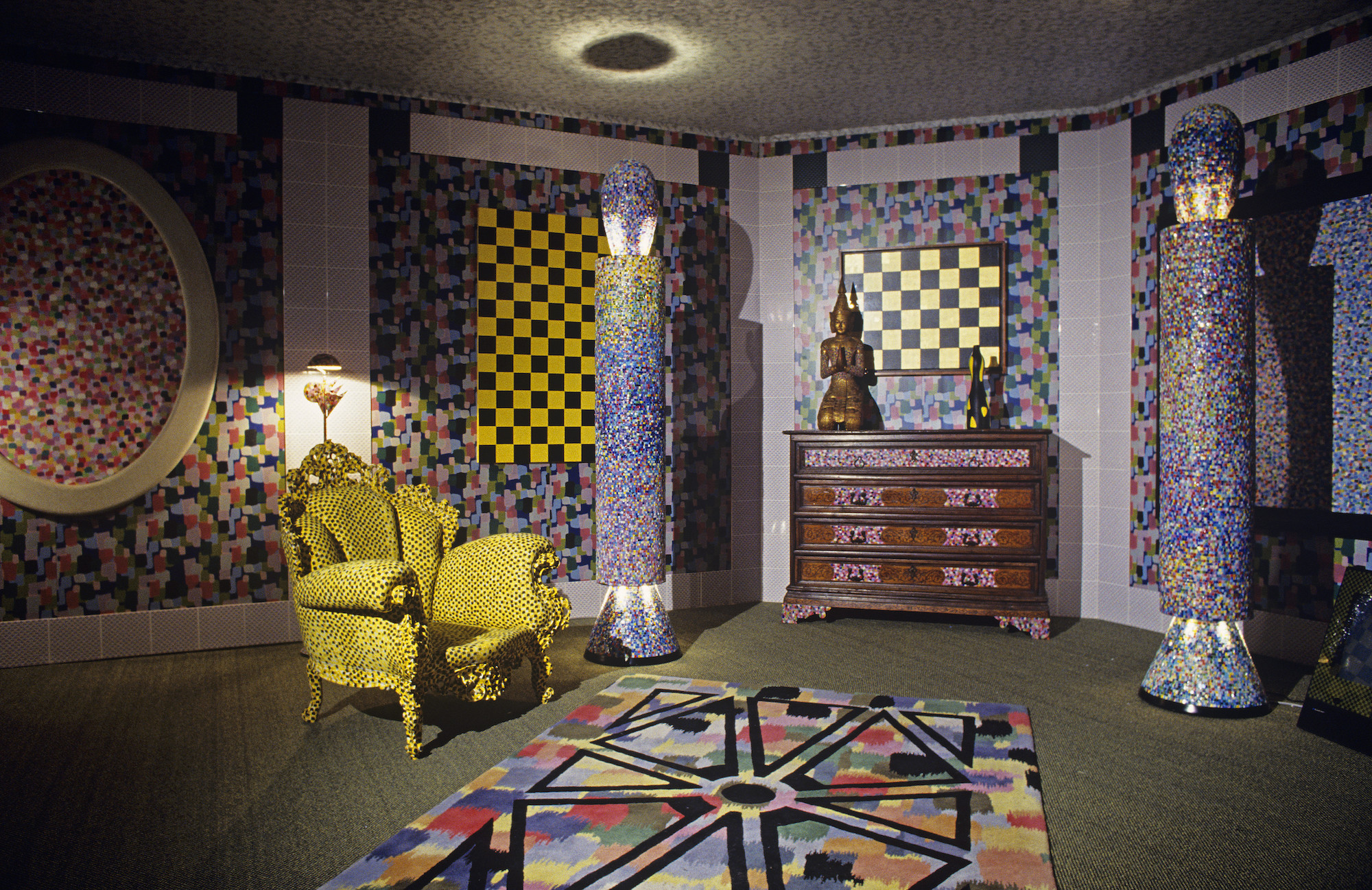
Mendini moved on and leftCasabellato start hisown magazine. He called it Modo, which was Mendini’s attempt to identify a new and more international spread of voices. At the same time, he joined Alessandro Guerriero and his sister Adriana who had opened a gallery in Milan that they called Studio Alchymia or Alchimia – spellings fluctuated over time. It was a name that signalled their counter-cultural aspirations, though in the English-speaking world, punk was already pouring scorn on hippiedom. Design was only one of the Guerriero’s many interests. Alchymia made connections with artists, explored radical ideas about fashion, and staged theatrical happenings and events in its gallery.
When Alessandro Mendini joined Guerriero, he came to be seen as the spokesman for Alchymia’s point of view. His platform as an editor first at Casabella, then at Modo and Domus, made Alchymia much more visible as a movement than it had previously been. Mendini had an ability to make memorable objects in a way that Guerriero did not. He started to design, or as he put it, ‘redesign’ pieces of furniture that, unlike the work made by Guerriero, placed a value on production quality. They even began to find a market. Guerriero and Mendini started to curate Alchymia exhibitions in which Sottsass, Andrea Branzi and Michele De Lucchi also took part.
Some years later Mendini wrote a manifesto for Alchymia in which he suggested that “Alchymia believes that memory and tradition are important. But the new drawing is free from rhetorical ghosts, frozen and decanted by Alchymia in a formal and kaleidoscopic style. Alchymia believes in despecialisation: ‘confused’ methods of creation and production can live side by side; crafts, industry, informatics, new and obsolete techniques and materials.”
Mendini had the idea of reinventing classic pieces of design; ‘decorating’ such icons of Italian furniture as Gio Ponti’s Superleggera chair by adorning it with flags. At least in part, he was suggesting that it wast ime for design to stop being ‘original’, and for designers to reflect on what had already been achieved before designing anything new. For an exhibition that he worked on in Ferrara in 1978, he came up with the Poltrona di Proust: painting a generic contemporary version of a baroque armchair with pointillist brush-strokes based on the French painter Paul Signac. It was taken up as part of Alchymia’s catalogue and sold in small numbers like a work of art, before being commercialised and mass produced.
It formed part of Alchymia’s Bau. haus collection shown at the Salone del Mobile in Milan in 1980, along with the Sinerpica table lamp designed by Michele de Lucchi, and Sottsass’s Le Strutture Tremano table. Mendini would later use the same decorative pointillism for a wristwatch that he produced for Swatch.
Sottsass did not last long with the group. He left Alchymia in part because of his frustration with Guerriero’s disorganisation, and also as a reflection of his fluctuating relationship with Mendini. However, as the fashion entrepreneur Elio Fiorucci, who was close both to Sottsass and Mendini, suggested, Memphis and Alchymia represented two versions of the same wave. Alchymia was about provocation. Memphis was going to be more serious, something like the Wiener Werkstätte founded in 1903 by Koloman Moser andJosef Hoffmann, or the design for production arm of the Bauhaus itself.
Modo and Studio Alchymia between them turned Mendini into a major figure in the worldwide phenomenon of postmodernism. It attracted the attention of Domus magazine, whose publisher decided to appoint him as the successor to founding editor Gio Ponti.
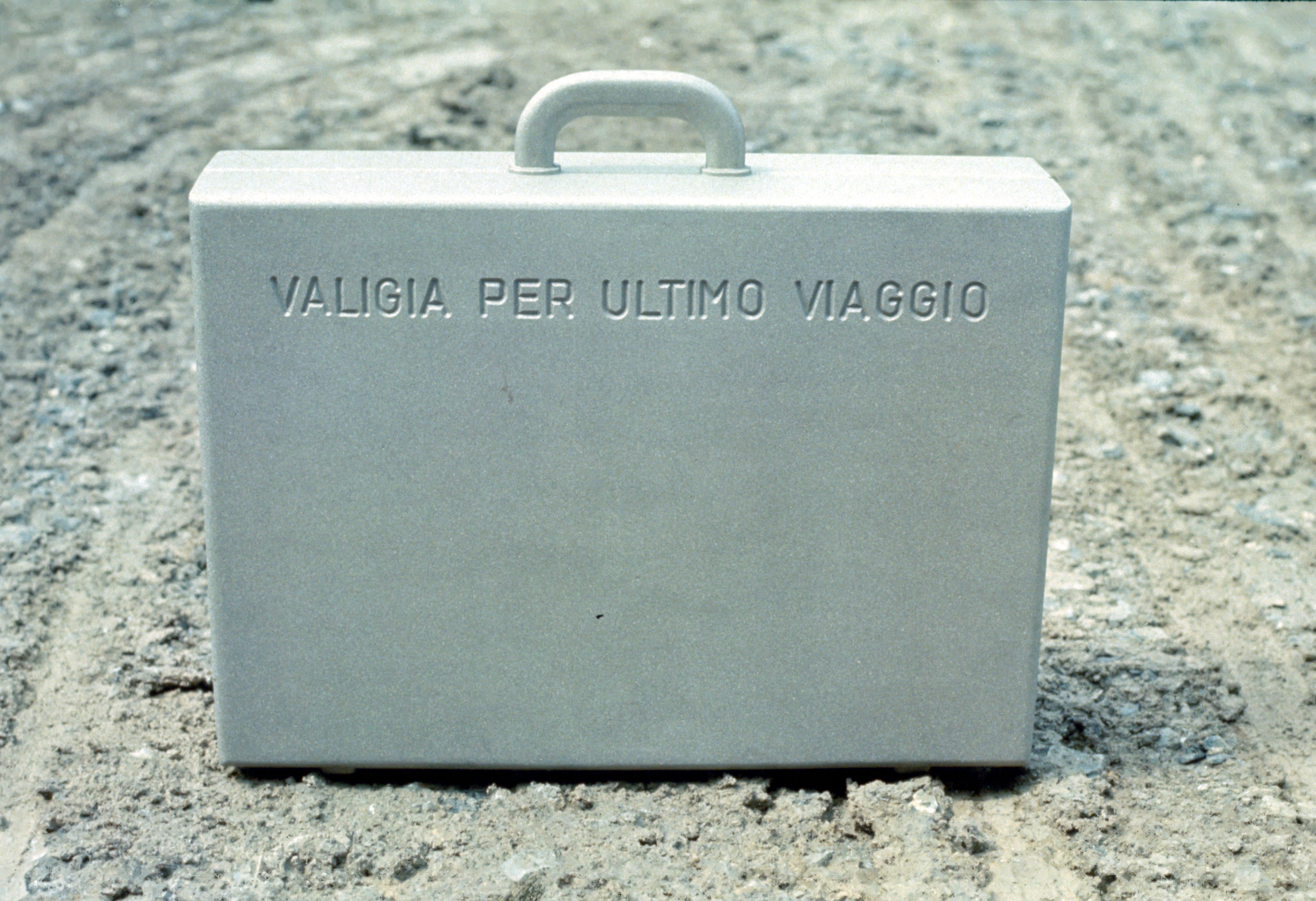
At Domus, where he had two distinct periods as editor, he learned from certain aspects of Andy Warhol’s Interview magazine, especially in the treatment of the covers, and offered a conceptual model that Hans-Ulrich Obrist would follow in his curatorial practice. His first years at Domus was the period in which he was closest to Ettore Sottsass. He asked Sottsass to de-sign the pages of the magazine, they would spend weekends together in Barcelona, and Mendini asked him to design for Alchymia. Mendini’s work as an art director, which began in the 1980s with Alessi and continued with Swatch, can be seen as another version of his skills as an editor – in the English meaning of the word, as an individual who sets a direction for a publication, and searches for a wide range of content to fill it. He was assembling material in such a way as to present a particular viewpoint, rather than to become a journal of record. Of course, there are individual works designed by Mendini himself for both Alessi and Swatch that are memorable for their own sake. But his real impact was in assembling work by others, beginning with the Venturis, Michael Graves and Richard Meier’s design for the Tea and Coffee Piazza. Mendini had caught something in the air, which would one day lead to Starck’s Juicy Salif, now perhaps presented as the embodiment of all the excesses of the 1980s, as much as Raymond Loewy’s work summed up the shallowness of the Streamline era. And Mendini was tireless in continuing to search the world for new and interesting people.
Mendini’s work on the Naples metro network was another example of that same talent for bringing together a collection of artists, architects and designers whose individual contributions are impressive, but where the project as a whole has the greatest significance.
As with the journalism that was once understood as the first draft of history, magazines provided a fascinating insight into particular moments in the evolution of design. But in their nature they were created in the heat of the moment, and do not always provide a picture that ages well. Looking at Groningen today, the appropriateness and the longevity of using an editorial strategy to shape the architecture of a museum is questionable. Starck’s design work may well one day be the subject of a rediscovery or a revival, but his architecture, like that of Michele de Lucchi’s pavilion, is slight. Both struggle to hold their own against Mendini and Wolf Prix.
Like Charles Jencks, whom he recruited to contribute to the original Tea and Coffee Piazza collection, Mendini was an intellectual as much, or perhaps more, than he was a designer. His design work was about strong ideas, rather than about formal or tactile qualities.
This is an edited version of a text published in the Electa catalogue for Alessandro Mendini’s exhibition.
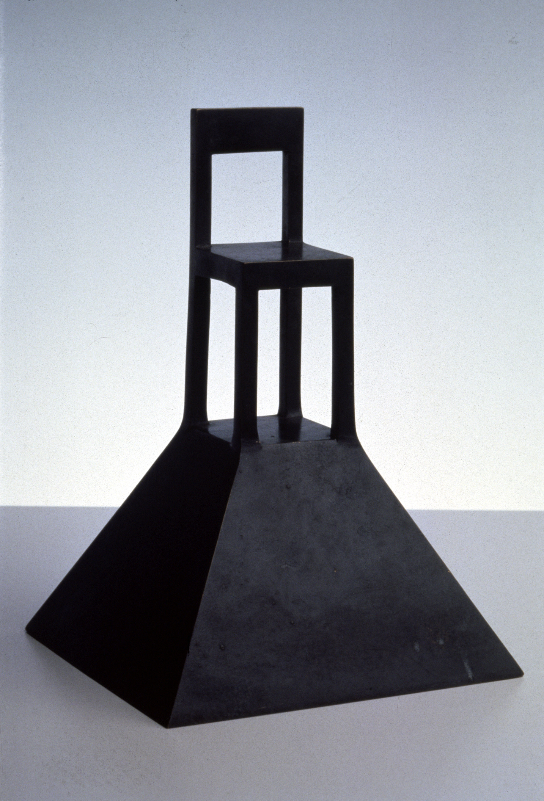
There is a comparison to be made between Mendini and Ettore Sottsass, whose relationship over the years fluctuated from close friendship to awkward rivalry. Just remember Mendini’s exhibition at the Triennale Quali cose siamo in 2010, where the only exhibit that related to Sottsass was Roberto Sambonet’s pitiless naked portrait of him. Mendini’s career was fundamentally about the exploration of a series of signs, symbols and arguments. Sottsass was ready to argue, but had a different sensibility. He knew how to give a chair, or a vase, or a machine form, as well as how to decorate it.
Having said that, the way that Louis Vuitton is now using Yayoi Kusama suggests that Mendini had a premonition about the direction that consumerism was taking, and the continuing relevance of his ideas. An effigy of Kusama stands 15m high in the centre of Paris. She holds a Louis Vuitton bag in one hand, and a brush in the other with which she is flicking paint at Bernard Arnault’s office across the street. The splashes stick to the length of the 19th-century stone façade like pastel-coloured cowpats. They are the same dots that decorate the company’s bags, which are the subject matter of her canvasses and which she first started painting onto the naked bodies of people taking part in Soho happenings in 1960s New York.
It’s a phenomenon that reflects the use Mendini made of Paul Signac’s brushstrokes at every scale, from the architecture of Groningen to that of a Swatch wristwatch, by way of the Poltrona di Proust. In the end, Mendini’s ability to span the gap between high culture and commerce, between theory and populism, may have been his most impressive achievement.
This feature appeared in Issue 2 of Anima, head here to purchase a copy or subscribe